Page 27 - Designing Ways 255
P. 27
- without resemblance to what was there
                                                                                before - were all conceptual choices that
                                                                                contribute to giving the house a defined
                                                                                identity. The colour scheme of the
                                                                                materials used on the exterior ensures that
                                                                                everything has a cohesive appearance,
                                                                                while the wood finish is testament to
                                                                                the  desire  to  integrate  with  the  natural
                                                                                context.
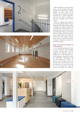
                                                                                  Inside, the original house’s geometry
                                                                                and architectural particularities were also
                                                                                showcased. Beneath the cathedral ceiling,
                                                                                a mezzanine was added to maximize the
                                                                                convertible floors. This space became one
                                                                                of the project’s key points of interest, with
                                                                                its double-height ceilings, natural light,
                                                                                bull’s-eye window, and exposed structure.
                                                                                On  the  home’s  interior walls,  where  the
                                                                                extension joins the existing structure,
                                                                                alcoves made of reclaimed wood provide
                                                                                workspaces, waiting rooms, and places for
                                                                                impromptu meetings.
                                                                                Happy coexistence between children and
                                                                                the administration
                                                                                  As a community organisation, the need
                                                                                for  room  is  immense,  while  the  budget
                                                                                is  limited.  Each  space  had  to  be  well
                                                                                thought-out and optimised to allow for
                                                                                multiple uses. A major challenge was to
                                                                                create harmonious coexistence between
                                                                                the organisation's administration and
                                                                                the areas designed for children. At
                                                                                garden level, the children’s rooms were
                                                                                adjacent to the yard with a play area, and
                                                                                the  staff  offices  were  located  on  the  top
                                                                                floor. On the ground floor, where the
                                                                                entrance was located, that coexistence


                                                                                                    dw • Issue 255   27

