
Page 71 - Designing Ways 272
P. 71
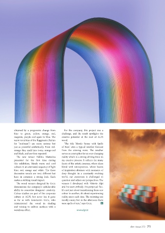
obtained by a progressive change from   For the company, this project was a
           blue to green, yellow, orange, red,   challenge, and the result spotlights the
           magenta, purple and again to blue. The   creative potential at the root of ALPI
           warm tonalities of the Raggiosole (Italian   wood.
           for "sunbeam") are more serious but   "The  title  'Mostly  Sunny  with  Spells
           just as powerful aesthetically. From red-  of  Rain'  cites  a typical  weather  forecast
           orange they meld into ivory, orange-red   from the evening news. The weather
           and black, and are then repeated.   serves as a metaphor for an ever-changing
             The new veneer Nebbia Mattutina   reality which is a strong driving force in
           presented for the first time during   my creative process. It reflects the many
           this exhibition, blends warm and cool   facets of the artistic journey, where ideas
           colours in an alternated sequence of light   blend with introspection, where bursts
           blue, red, orange and white. The three   of inspiration alternate with moments of
           decorative woods are very different but   deep thought. In a constantly evolving
           have in common a strong look. Each   world, our awareness is challenged to
           makes a striking visual impact.    question and adjust our perspectives. The
             The wood veneers designed by Grcic   veneers I developed with Vittorio Alpi
           demonstrate the company's unbelievable   and his team embody this perpetual flux.
           ability to concretise designers' creativity.   It's not just about transitioning from one
           Colour studies are part of the corporate   colour to another; it's about experiencing
           culture at ALPI,  but  never has it  gone   reality anew each time. The morning was
           as far as with Konstantin Grcic, who   mostly sunny, but in the afternoon there
           reinterpreted the wood in shading   were spells of rain," says Grcic.  dw
           and veining to enliven surfaces with a
           wondrous effect.                             www.alpi.it


                                                                                                    dw • Issue 272   71