Page 69 - Designing Ways 276
P. 69

It represents not only an important
                                                                                statement about languages - especially
                                                                                indigenous language - but Arcand also
                                                                                offers an invitation to discover her own
                                                                                exploration and struggle to learn her
                                                                                community's language of Plains Cree as a
                                                                                way "to bring awareness to the precarious
                                                                                state of many Indegenous languages." The
                                                                                messages can be read by those who know
                                                                                the Cree alphabet, but are also addressed
                                                                                to those who cannot. Arcand's use of the
                                                                                vernacular language introduces a subtle
                                                                                humour by appropriating these common
                                                                                elements, past and present, found in our
                                                                                western environments. This subtle and
                                                                                intelligent humour is also found in the
                                                                                small poster of her Cree “Comic Sans”
                                                                                alphabet, as if suggesting that there would
                                                                                be a serif version of the Cree alphabet.
                                                                                  joitarcand.com

                                                                                Artists at the UQAM Centre de design
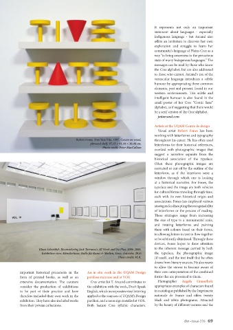
                                                                                  Visual artist  Robert  Fones has been
                                                                                working with letterforms and typography
                                        Robert Fones, Tive/Tate/Tile, 1997, Casein on wood,   throughout his career. He has often used
                                               plywood shelf, 97,15 × 91,44 × 30,48 cm,     letterforms for their historical references,
                                                     Photo credit: Peter MacCallum
                                                                                overlaid  with  photographic  images that
                                                                                suggest a narrative separate from the
                                                                                historical association of the typeface.
                                                                                Often these photographic images are
                                                                                restricted or cut off by the outline of the
                                                                                letterform, as if the letterform were a
                                                                                window through which one is looking
                                                                                at  a  historical  narrative. For  Fones,  the
                                                                                typeface and the image are both vehicles
                                                                                for cultural forms traveling through time,
                                                                                each with its own historical origin and
                                                                                associations. Fones has employed various
                                                                                strategies for disrupting the recognisability
                                                                                of letterforms or the process of reading.
                                                                                These strategies range from increasing
                                                                                the  size  of  type  to  a  monumental  scale,
                                                                                and rotating letterforms and painting
                                                                                them with colours based on their forms,
                                                                                to allowing letters in text to flow together
                                                                                or be arbitrarily disjointed. Through these
                                                                                devices, Fones hopes to draw attention
                     Klaus Scherübel, Reconsidering Jack Torrance’s All Work and No Play, 2006-2008,  to the inherent message carried by both
                      Exhibition view, Künstlerhaus, Halle für Kunst & Medien, Graz, Autriche, 2016  the  typeface, the  photographic  image
                                                             Photo credit: M.K.  (if used), and the text itself that he often
                                                                                draws from literary sources. He also wants
                                                                                to allow the viewer to become aware of
           important historical precedents in the   An in situ work in the UQAM Design   their own interpretation of the combined
           form  of  printed  books,  as  well  as  an   pavilion staircase and at VOX  forms that are presented to them.
           extensive documentation. The curators   Cree artist Joi T. Arcand contributes to   Photographer   Angela  Grauerholz
           consider the production of exhibitions   the exhibition with the work, Don't Speak   appropriates examples of characters found
           to be part of their practice and have   English, which incorporates vinyl lettering   in a catalogue published by the Imprimerie
           therefore included their own work in the   applied to the staircase of UQAM's Design   nationale de France and offers twenty
           exhibition. They have also included works   pavilion, and a neon sign installed at VOX.   black and white photograms. Attracted
           from their private collections.    Both feature Cree syllabic characters.   by the beauty of different textures and the


                                                                                                    dw • Issue 276   69
   64   65   66   67   68   69   70   71   72   73   74