Page 21 - Designing Ways 280
P. 21
and a raised stone walkway which recall
           a traditional Japanese garden, pared
           down to its essential elements in a spirit
           of minimalism. Employing a dark colour
           palette here, the designer wanted to
           introduce the feeling of a calm moonlit
           evening, while the main source of natural
           light is the dining room of the restaurant
           beyond, drawing visitors in.
             Overhead, curved panels catch the light
           from above, while also calling attention
           to the restaurant to visitors looking down
           from the mall level above.
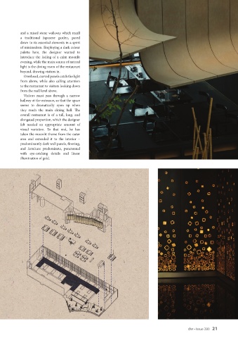
             Visitors  must  pass  through  a  narrow
           hallway at the entrance, so that the space
           seems to dramatically open up when
           they  reach  the  main  dining  hall.  The
           overall restaurant is of a tall, long, and
           elongated proportion, which the designer
           felt needed an appropriate amount of
           visual  variation.  To  that  end,  he has
           taken the moonlit theme from the outer
           area and extended it to the interior –
           predominantly dark wall panels, flooring,
           and furniture predominate, punctuated
           with  eye-catching  details  and linear
           illumination of gold.


                                                                                                    dw • Issue 280   21

